Times Square is usually described as a storm of light: billboards, screens, logos, advertisements that never sleep. When I first started working there, I wanted to know what would happen if I pushed all of that aside and treated the square not as an image but as a set of surfaces. Instead of capturing the spectacle, I began to decompose it texture by texture, surface by surface, and also chromatically, following a sensory ethnographic interest in how environments are felt, seen, and materialized. (Pink 2015)
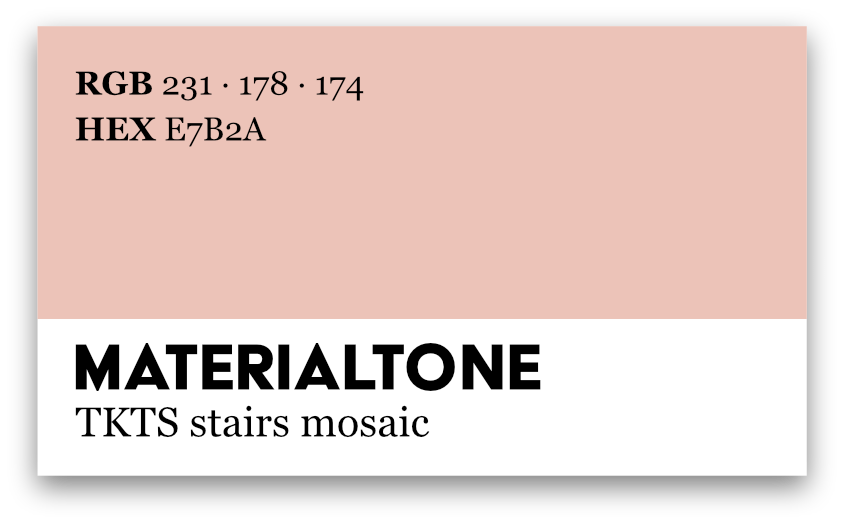
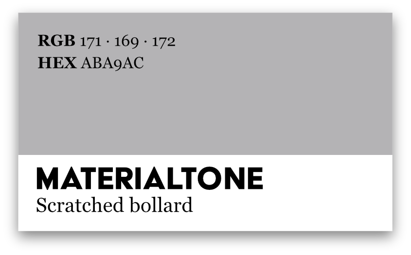
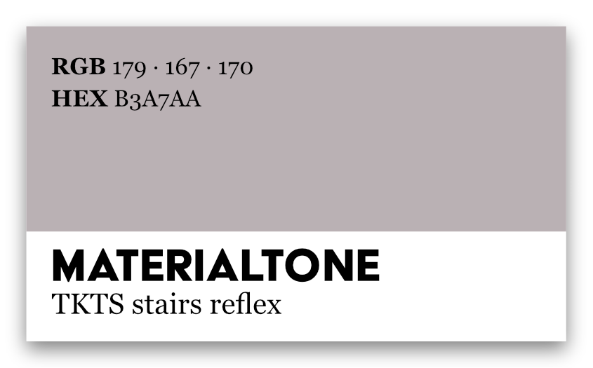
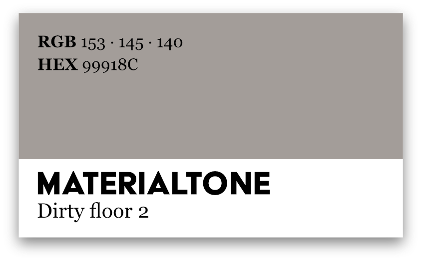
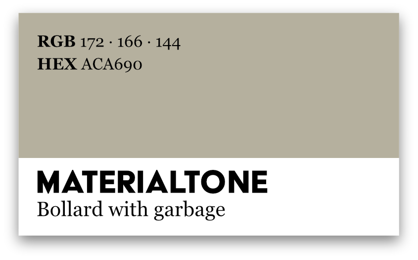
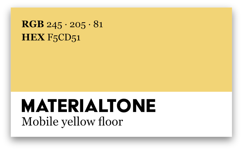
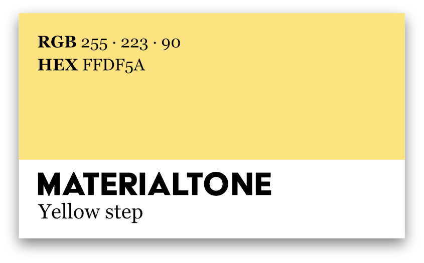
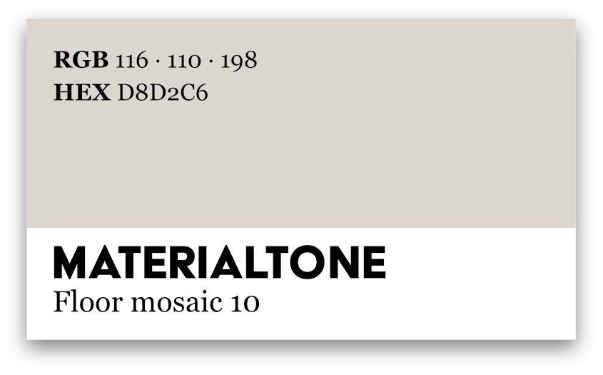
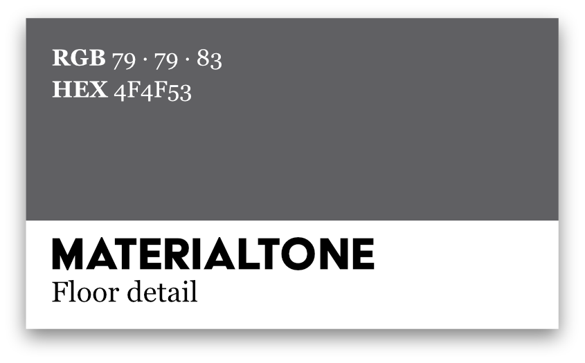
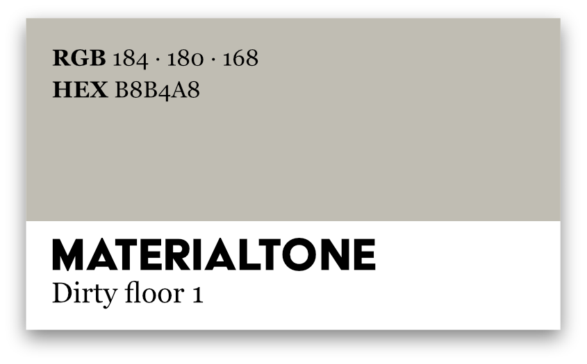
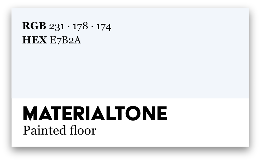
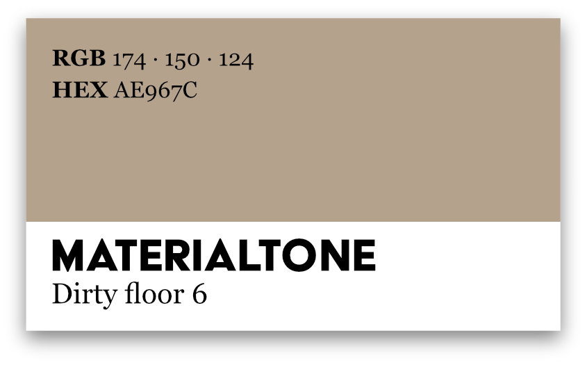
The image below is one of three graphs resulting from that experiment. Each swatch is a color sampled from a particular object: TKTS stairs, scratched bollards, dirty tiles, pipes with screws, fragments of mosaic floors. What looks like a design exercise is, in fact, a form of fieldwork: a chromatic decomposition of Times Square.
From saturated spectacle to sampled surface
Chromatic decomposition starts with a simple refusal: not to photograph the big screens, but everything that supports them. I walked the square looking down rather than up, paying attention to steps, stains, seams, and small infrastructural details. This echoes approaches that treat walking as a way of knowing—moving through the city to trace paths, tactics, and trajectories instead of fixed panoramas. (de Certeau 1984; Ingold 2011)
I took close-up photographs of stairs, railings, floor mosaics, pipes, gums, and metal plates. Back in the studio, I used a digital color picker to sample tiny fragments of those images: a patch of worn paint on a bollard, the dusty yellow of a mobile floor, the bruised purple of a mosaic tile. Each sample produced a set of codes (RGB, HEX) and, importantly, demanded a name. “TKTS stairs mosaic,” “Bollard with garbage,” “Dirty floor 4,” “Mobile yellow floor.” Naming tones became a way of storing micro-stories about use, maintenance, and decay.
The resulting palette is a decomposition of Times Square into chromatic micro-specimens. Instead of a single saturated image of urban spectacle, we get a cabinet of modest tones, each one attached to a specific material scene.
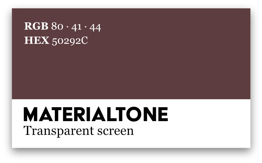
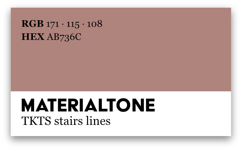
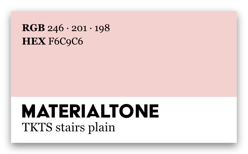
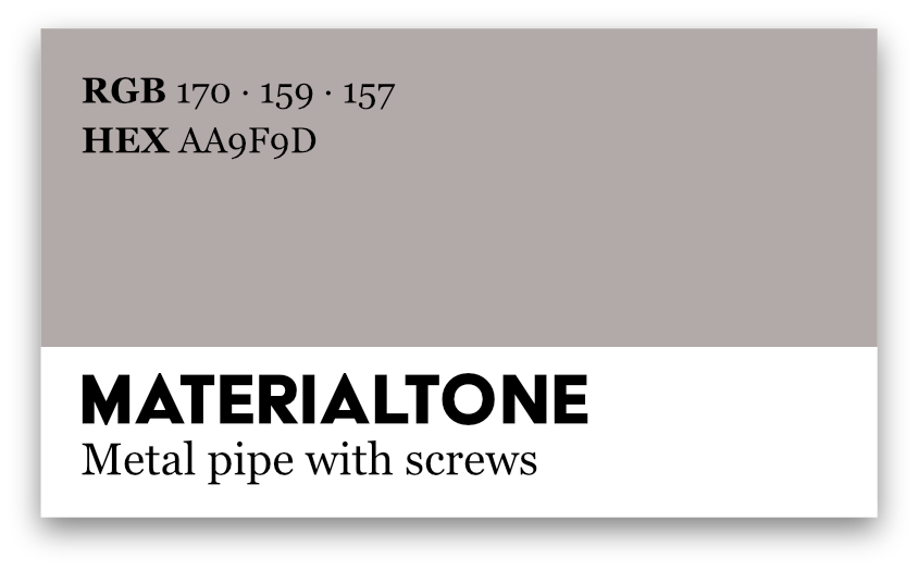

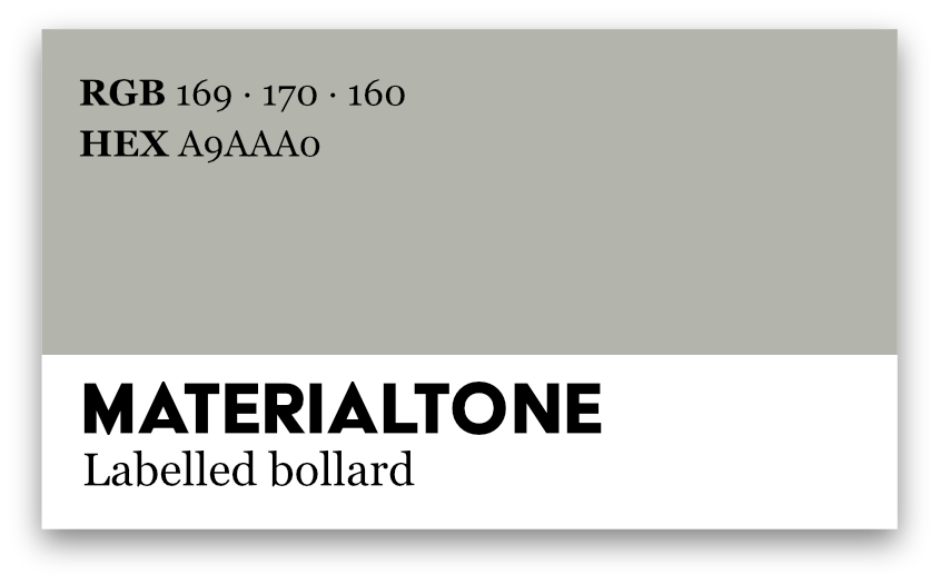
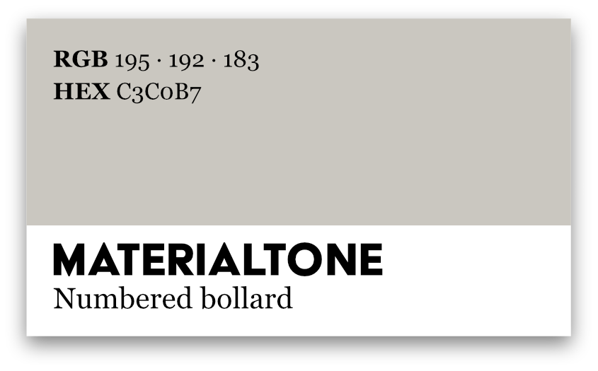
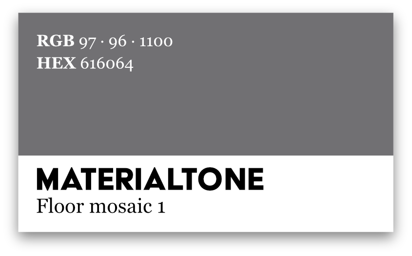
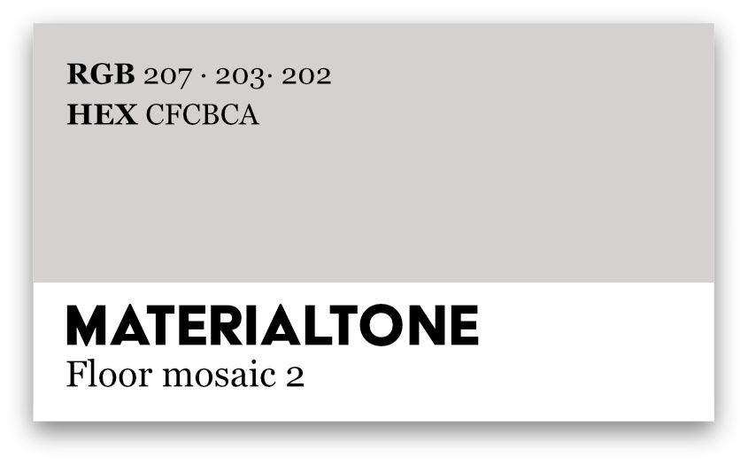
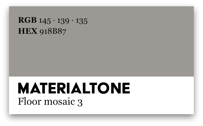
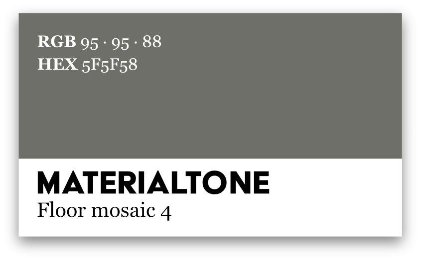
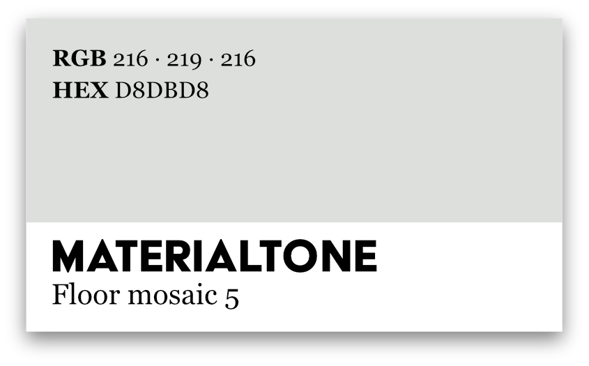
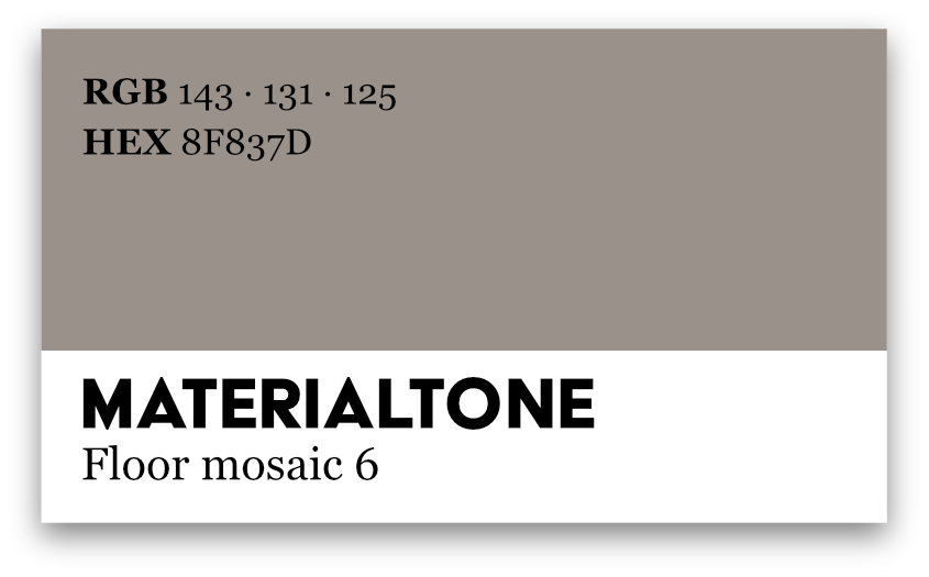
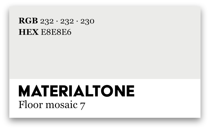
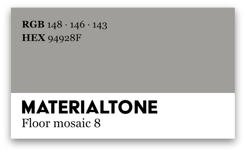
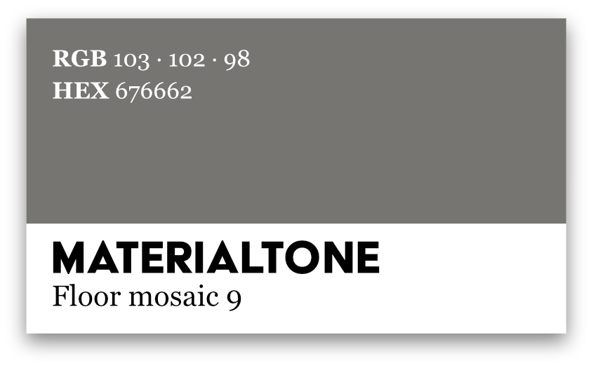

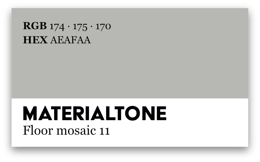
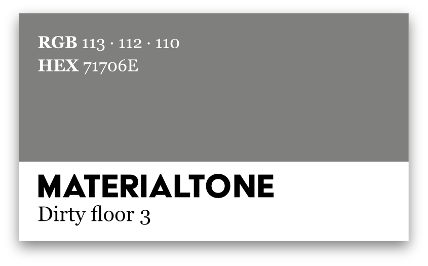
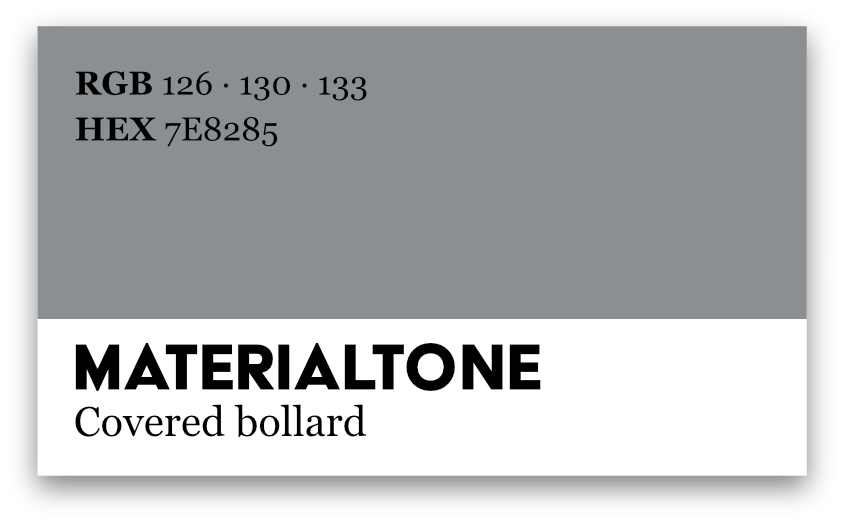
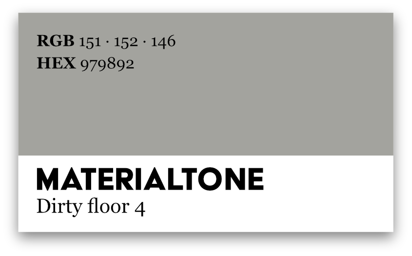
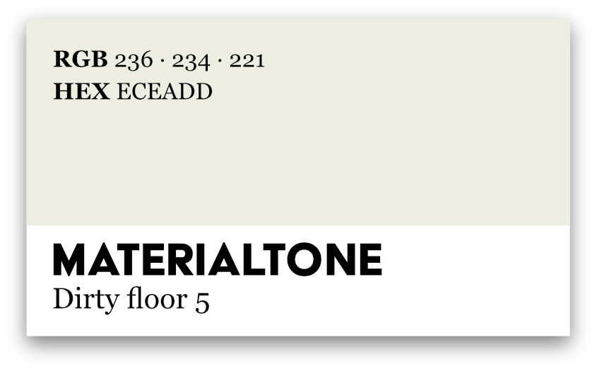
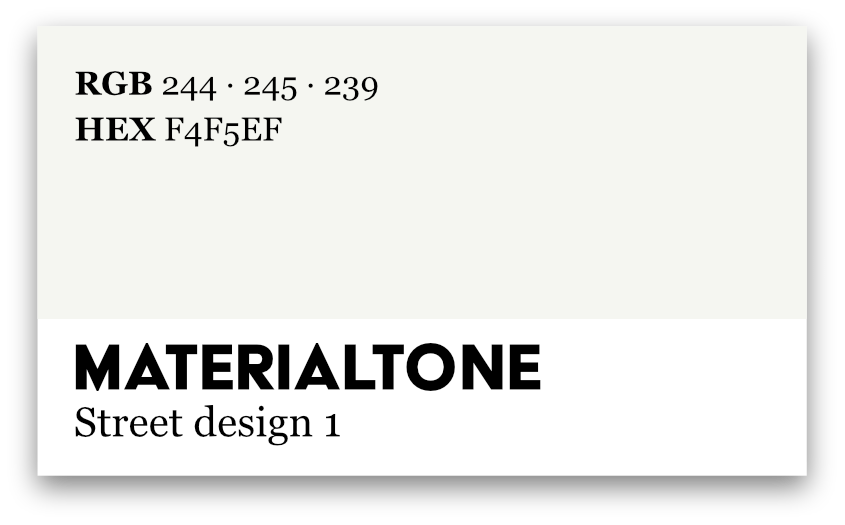
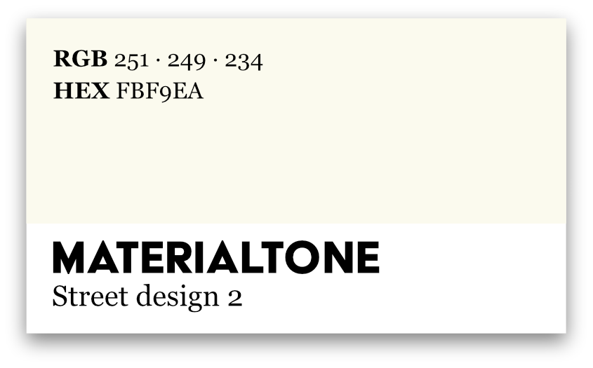
This, of course, is just a departure point for further multimodal research explorations of urban places. The cards operate as small, portable infrastructures of inquiry. They are not just illustrations of findings; they are devices that help generate new ones. Additionally, they raise new questions, such as: what color does text forget? What do urban color palettes reveal about hidden regimes of standards, norms, and regulations? How do chromatic atmospheres (a street that is beige primarily vs. one saturated with bright paints) shape moods, forms of attention, or feelings of safety and belonging?
References
- de Certeau, Michel. 1984. The Practice of Everyday Life. Translated by Steven Rendall. Berkeley: University of California Press.
- Ingold, Tim. 2011. Being Alive: Essays on Movement, Knowledge and Description. London: Routledge.
- Pink, Sarah. 2015. Doing Sensory Ethnography. 2nd ed. London: SAGE Publications Ltd.
