Graphically speaking, sorrego.net has never been a “single-style” website. It has been a collage of attempts: different techniques, shifting moods, small visual obsessions that come and go. I’m not a trained graphic designer or illustrator, but I genuinely enjoy making images—testing layouts, sketching icons, trying new textures, borrowing tricks, failing, and trying again. Over time, the blog has become more than a place to publish and archive my ethnographic work: it’s also turned into a sandbox for visual experimentation.
In that sense, the site subtly reflects my approach to practicing anthropology. My ethnographic work tends to lean toward the multimodal—not because it’s trendy, but because it allows me to think with form. Images, diagrams, typographic play, micro-layout decisions: they are not just decoration. They can act as field devices, as prompts for attention, as ways of organizing fragments, as tools for composing relationships. The blog has become a companion to that impulse: a space where my writing practice and my visual practice keep contaminating each other in productive ways.
Over the last few months, though, one aesthetic has pulled me in more strongly than the others: risography. I don’t own a risograph, and I’m not approaching it from the “printing geek” angle. What seduces me is the visual logic: the DIY feel, the boldness, the tactile imperfections, the way the image appears both crisp and unstable, as if it’s always slightly vibrating. Riso results feel humble and stunning at the same time. They also think possible: relatively easy to prepare for printing when I want to move something from screen to paper.
But the main shift I’m sensing is not just “I like how riso looks.” It’s a desire to use it more consciously—to push it beyond a convenient visual resource and into something closer to a method. To let it shape how I compose ethnographic materials, how I assemble fragments, how I make concepts visible without over-explaining them. If multimodal ethnography is partly about building forms that can carry thought, then riso (and its family of constraints) starts to look like a serious ally.
This doesn’t mean I want to delete my past work or redesign everything from scratch. I actually like that the blog contains a visible history of shifting aesthetics—a kind of sedimentation of attempts. What I want instead is to begin consolidating a style that feels mine, without erasing the archive of earlier versions.
Lately, I’ve been thinking of a hybrid direction: risograph logic plus halftone. Two techniques that are versatile, relatively inexpensive to produce, and visually generous. Together, they offer a grammar I can keep learning: limited palettes, layered tones, purposeful misregistration, visible dot structures, textured shadows, bold flat fields, and a slightly “printed” attitude even when the work stays digital.
A Working Palette
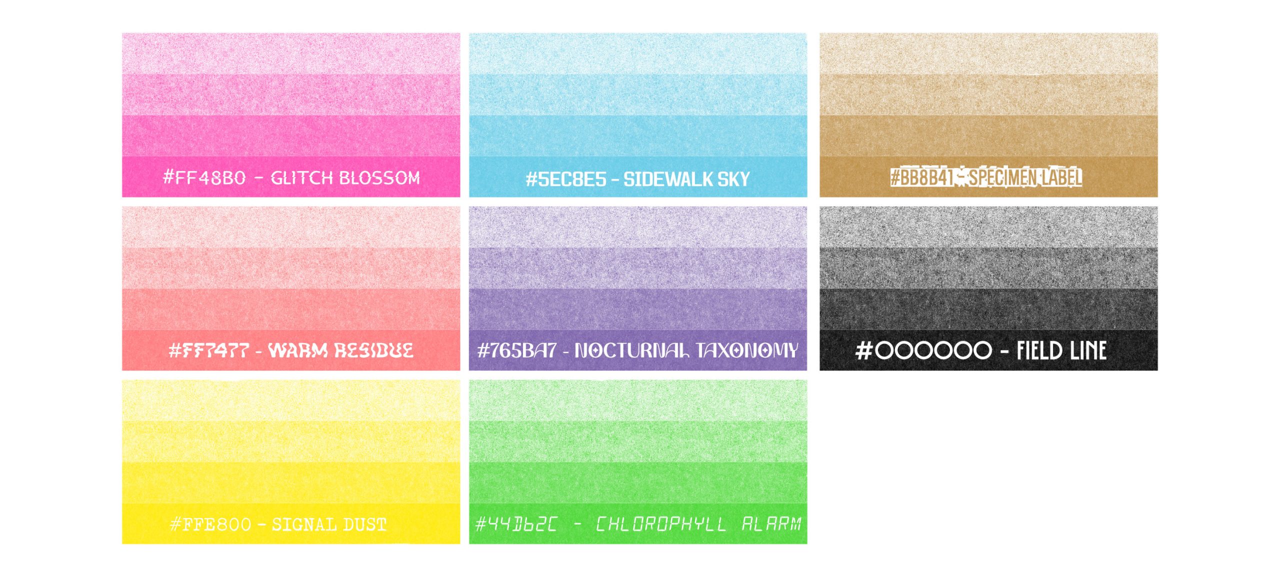
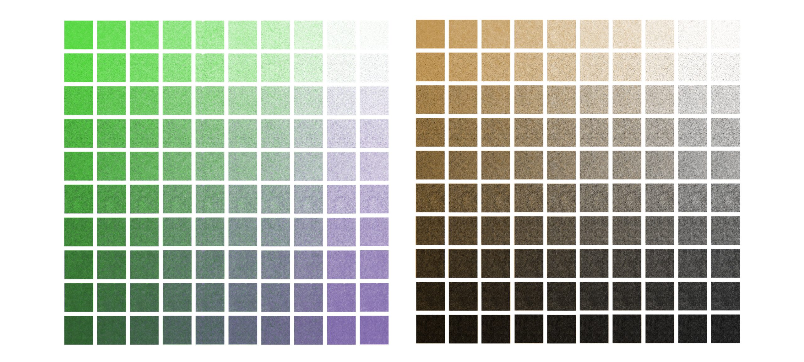
To make this shift concrete, I’ve put together a small eight-ink palette—colors I selected from risograph print shops across Europe, Japan, and North America. The goal is not to “standardize” everything, but to give my work a stable toolbox: a set of inks I can return to, combine, and learn deeply over time.
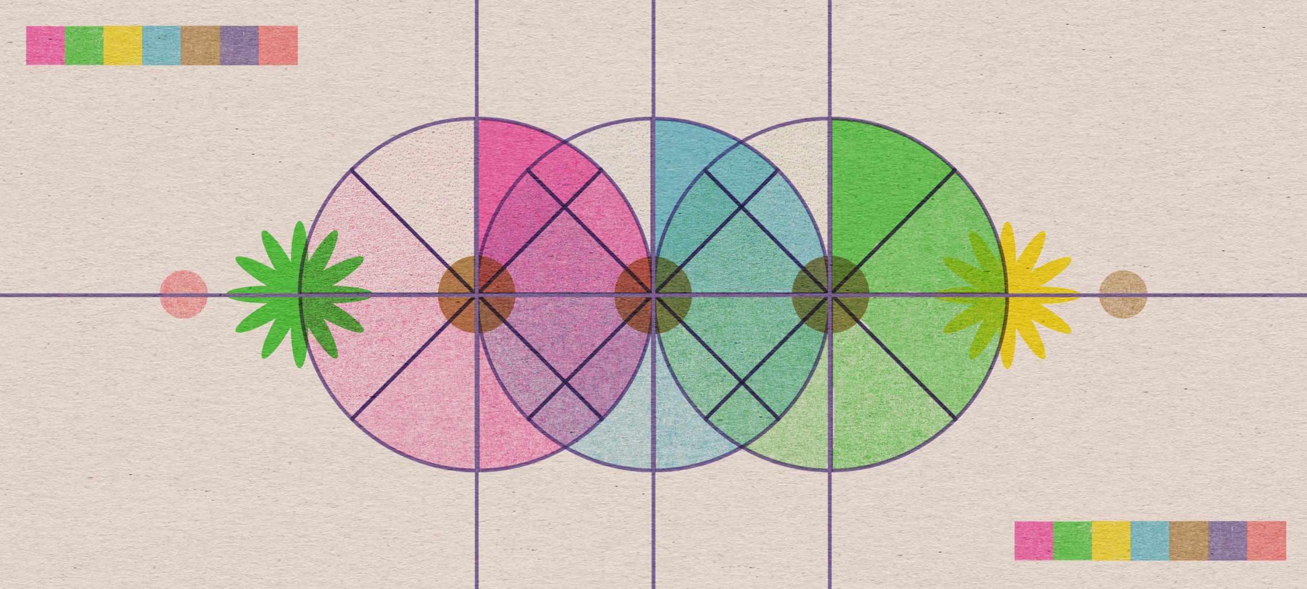
Two-Ink Overprints: What the Palette Can Produce
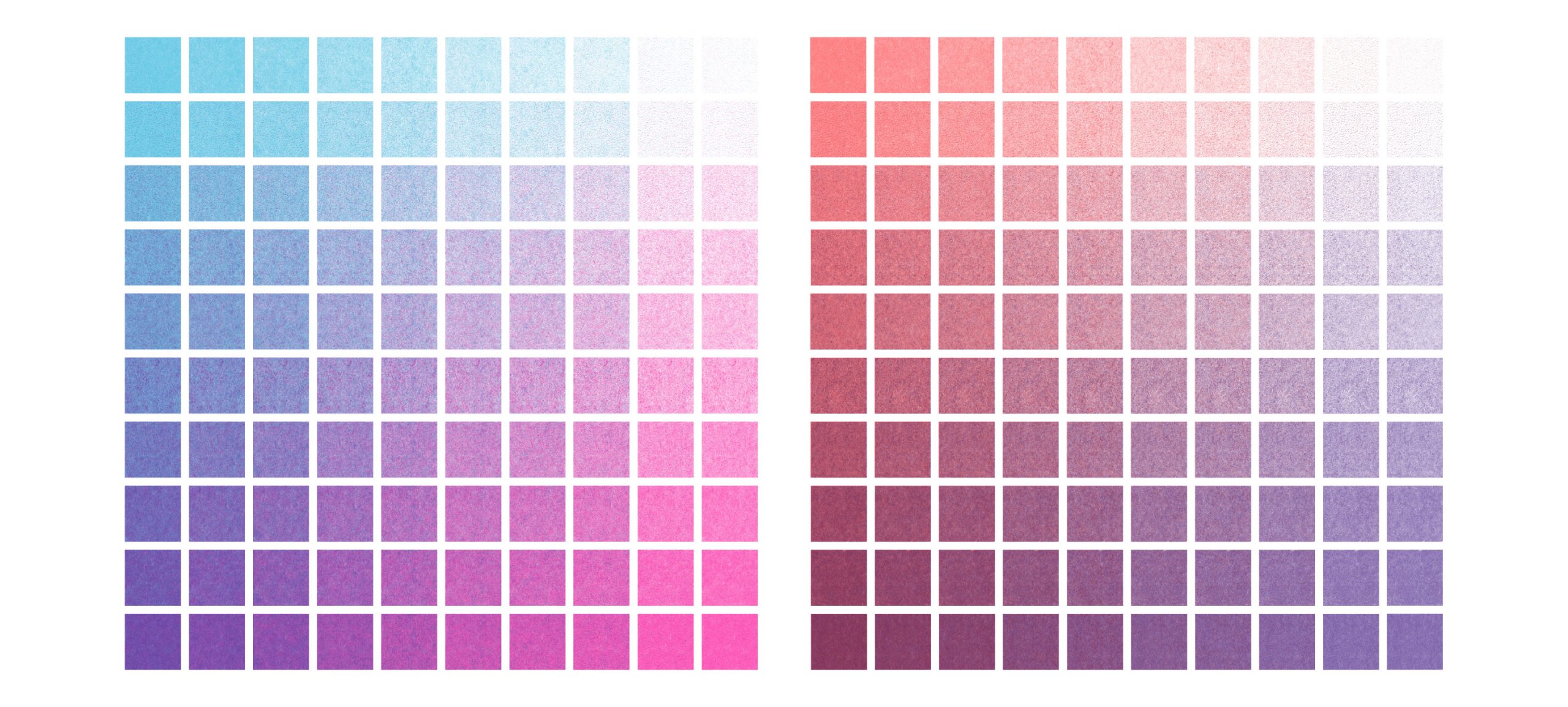
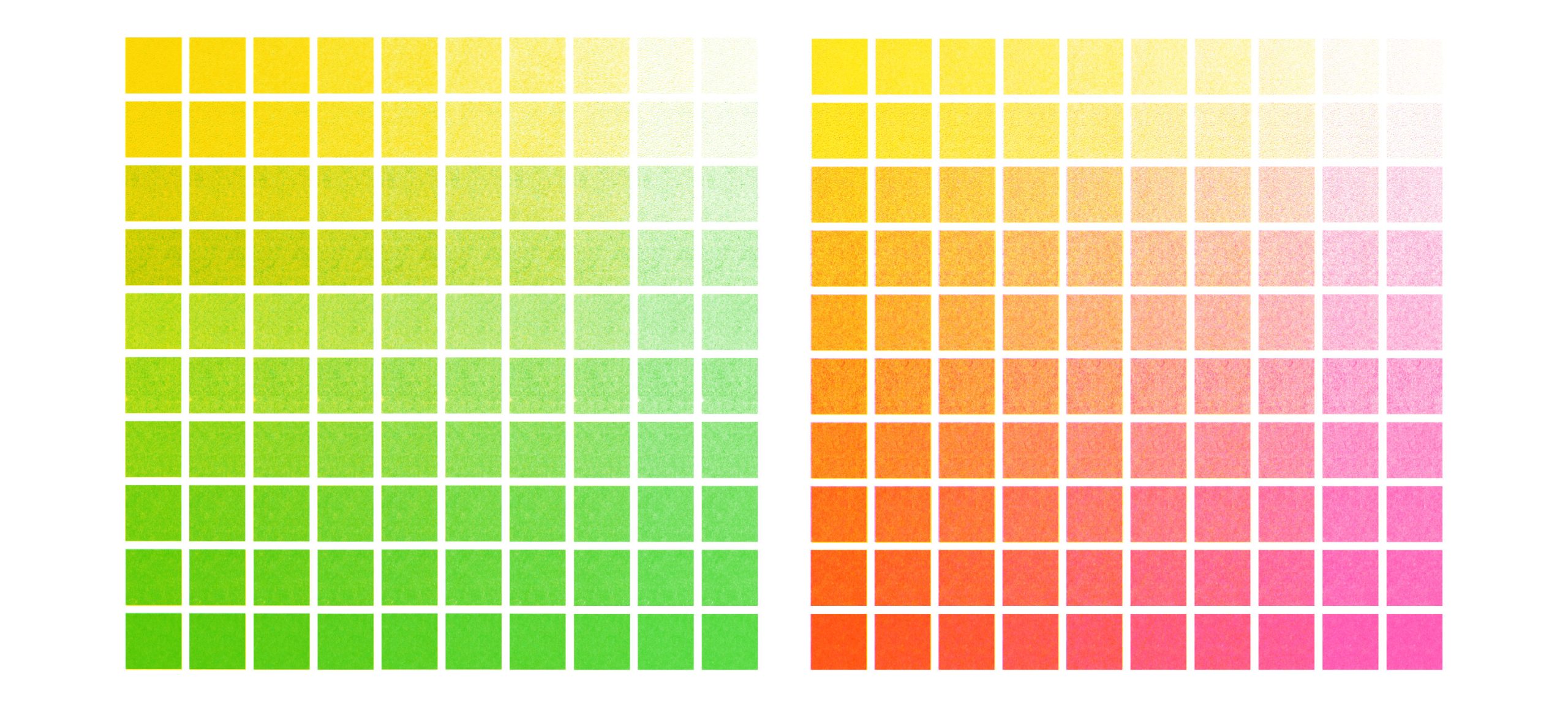
Before thinking about “final designs,” I wanted to see what this palette does when treated as riso is often treated: two inks, many densities. The following grids map the behavior of specific pairings—how overlaps generate third tones, and how small shifts in coverage create entirely different atmospheres.
Mini Manifesto: Two Inks Per Piece
From now on, I want to work with a simple constraint: two inks per piece. Not as a limitation, but as a method. Two inks force decisions—about what counts as structure, what counts as atmosphere, and what should remain a trace. Most of the time, one layer will carry the spine of the graphic (type, linework, labels, grids), and the second will carry the weather of the piece (a wash, a shadow, a stain, a signal). The “third color” will not be selected—it will be produced through overlap, misregistration, and halftone density. In that sense, the palette becomes a small ethnographic device: a way of making meaning through constraint, of letting the image emerge from controlled accidents rather than from infinite options.
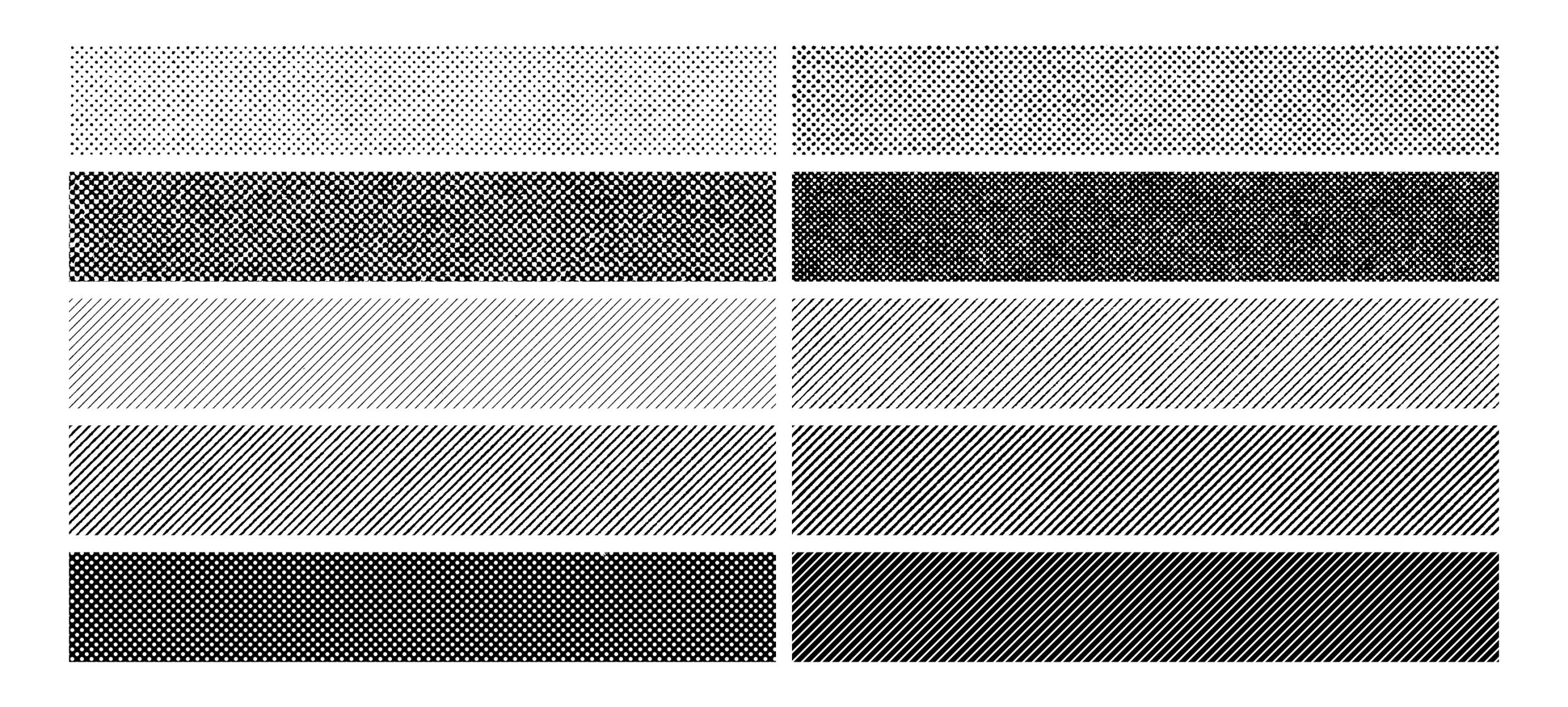
Halftone as Method
If risography is my palette discipline, halftone is my control surface. Halftone lets me stretch an ink—from whisper to saturation—without adding a new color. It’s also where the “print feeling” emerges most clearly: texture, vibration, grain, and the visible labor of the image.
A Timeline of Becoming
The blog will keep doing what it has always done—hosting my ethnographic writing and multimodal experiments—but now it will also work more explicitly as a timeline of improvement: an exhibition of trials, refinements, misregistrations, and small discoveries. I’m not aiming for a final style in one move. I’m aiming for a practice I can repeat until it becomes recognizable—until this palette stops being a reference and starts feeling like a voice.